15. Exercise: Professional Presentations
Exercise: Professional Presentations
In the following exercise, you are given a data set of information about U.S. colleges. The data set is available in the resources at the bottom of the page as american_colleges.xlsx, but can also be downloaded from mathforum.org, where several data sets are available for you to experiment with.
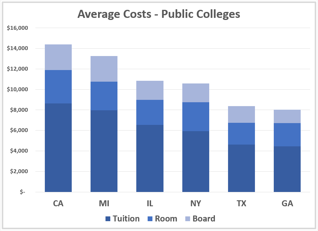
Imagine that you are given the task of preparing a graphic for a high school counselor's presentation on college choices to students and their parents. The families are just starting to look at their choices and this graphic is only one part of the talk. It's meant to show the audience that costs may vary by location. The counselor wants a comparison of costs between a few (6) example states from across the U.S.
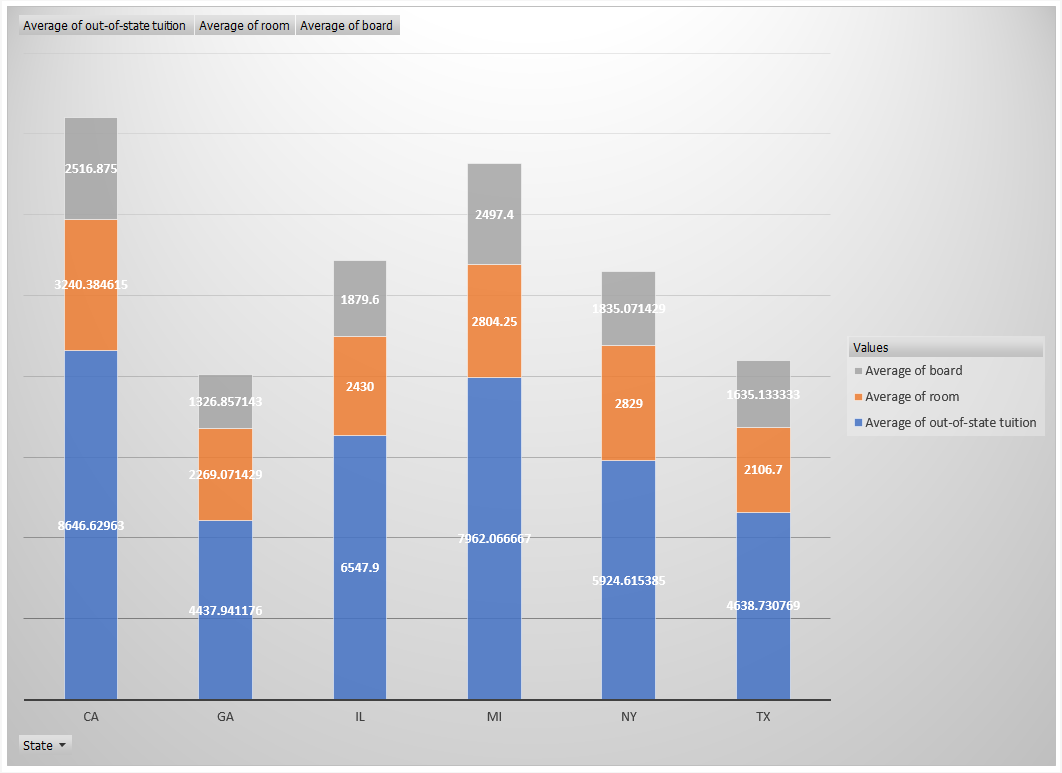
You will create a stacked column chart that compares average costs of attending a public college among six states: California (CA), Texas (TX), New York (NY), Michigan (MI), Georgia (GA), and Illinois (IL). We'll assume that the cost we want to look at only includes the out-of-state tuition, room, and board. While preparing your chart, keep in mind the following questions from the lesson:
- What questions are you trying to answer?
- What patterns are you trying to show?
- Who is the audience?
- Overview or in depth?
Task Description:
The following list has a series of steps for this exercise. As you complete each step, check it off the list. The quizzes in the task list can be found below.
Task Feedback:
Congratulations!
Public Selected
QUESTION:
How many records are in the Public Selected data set? Don't include the header row in your count.
SOLUTION:
NOTE: The solutions are expressed in RegEx pattern. Udacity uses these patterns to check the given answer
Pivot
QUESTION:
What is the average room cost for Illinois public colleges, rounded to the nearest dollar? (do not include decimal points or cents)
SOLUTION:
NOTE: The solutions are expressed in RegEx pattern. Udacity uses these patterns to check the given answer

Stacked Column
SOLUTION:
- Change the background color to something that makes the graph easy to read like white
- Change the numbers to dollars with no decimals
- Reorder the categories with the highest total on the left to the lowest total on the right
- Hide all Field Buttons (**PivotChart Tools->Analyze->Field Buttons**)
- Add a Title
- Remove the individual values in the stacked columns, but add a labeled axis on the left
- Make all the labels and number bigger so the audience can see them
The choices in presentation are somewhat of a judgement call and there are many permutations you can make to your chart regarding color and design elements. Maybe you don't need to break down the chart in this case as tuition, room, and board at all, but rather just the total average cost. Below is a reconfiguration of the stacked column chart. Yours may look a little different, and that's okay. The main point of this exercise is to think each time about what you want to show and who you are showing it to.
